Air traffic control for enterprise video.
I was the founding product designer of an
award-winning platform for media companies to deliver live and on demand video on every screen.
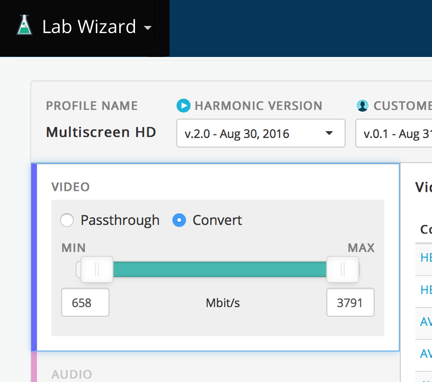
Fig 3: Channels
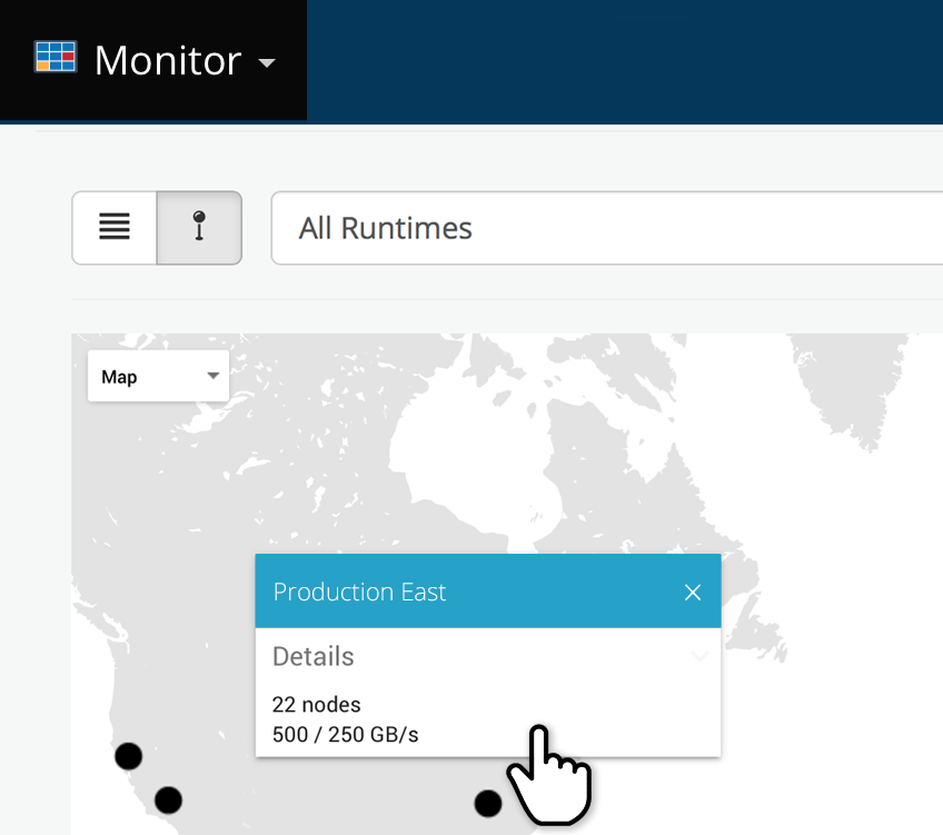
Fig 4: Monitor and Manage video
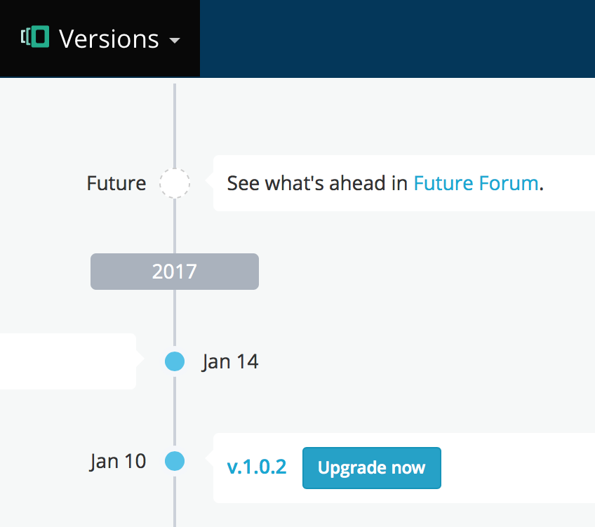
Fig 5: Future Forum
⊡⊡⊡
Background
I joined
this video tech company to help them transition their legacy hardware products to modern, cloud-native software, and in the process, solve a dire problem. They had over 50 different user interfaces in their portfolio with non-intuitive workflows that mostly looked bad and behaved worse. The UIs were inconsistent with each other, bound by no ecosystem and often overlapped in functionality—the cumulative effect of many product initiatives and acquisitions with various, lacking design standards.
Fig 6: Before—50+ disconnected products. Non-intuitive, unattractive and inconsistent UIs
Approach & Process
In the past, my employer's Product Managers would take nearly every customer-requested feature and add it to their products, also exposing the same to thousands of other, unexpecting users. This approach resulted in "death by a thousand cuts" and code-bloat which hampered agility. In effect, the lack of a good process led to this dysfunctional dynamic, and it needed to change before the product design could improve. So, one of my first jobs was to evangelize a design-driven software process and change minds at my employer. I presented my approach to internal stake holders to get us started on the right foot.
Fig 7: Design Process
Discover
In a redesign it's counterproductive to fixate on the legacy product. Instead, I take a step back to look at the market and users to gain a deep understanding of context. Good design flows from good discovery and research. It's the first, essential step in the process.
My cyclical discovery for VOS consisted of a combination of internal interviews with SMEs (subject matter experts), competitor analysis, customer visits and analysis of legacy usage data.
For customer visits, I arrived onsite with a simple plan: First, I asked a handful of broad questions, and listened attentively. Second, I passively observed users in their work environments. My direct exposure revealed something quite different from previous assumptions. The users were paralyzed by a maze of complexity, and the disorganized UI was scaring customers away to the competition.
Fig 8: Customer visits
Fig 9: Customer comments
We spend significant resources training our employees to use your products due to an unreasonably high learning curve.
—CUSTOMER A
It's extremely time-consuming to install and upgrade your products. A dozen confusing applications, unmanaged dependencies and buggy installation procedures.
—CUSTOMER B
Define
With a plethora of useful research documented, I collaborated with my Product Managers to interpret it and define solutions. Naturally, this involved a lot of trial-and-error, so we quickly sketched ideas on the white-board and captured them to a photo stream for subsequent review. Then, we filtered the best from the rest and reached consensus to proceed. From this came a product design plan with room to change and grow.
Fig 10: White-boarding
I gave more structure to our concepts by developing storyboards, wireframes and umbrella schematics. These began to solidify the platform structure, workflows, taxonomy and terminology which would be the springboard for an interaction framework.
Fig 11: Definition—platform structure, taxonomy and labeling
Design
It's exciting see ideas take form in high fidelity screens, but particularly on a platform of such ambitious scope, there's more than aesthetics happening in the design stage. It begins with a well-crafted interaction style guide, including behaviors comprised of custom components (Javascript) and look-and-feel elements comprised of stylistic classes (CSS) derived from the company brand. The result should support usability standards, incorporate the thought and planning invested in discovery, express the company's personality and ultimately provide continuity throughout every interaction in a large-scale, multi-app platform. Good design, like good coding, is object-oriented which means we don't need to reinvent the wheel every time a similar user interaction is needed on subsequent use cases.
My style guide delivered clear documentation and client-tested templates with classes customized specifically for the current needs and growth expectations of our platform. As this was Web-based software, all front-end deliverables were responsive and mobile-first, primed for production deployment.
The assets were published to an internal Web portal, appropriately called "UXHub", with styles, components, patterns and a semi-functional prototype delivered in a version-controlled repository. The code contained helpful comments with references to Confluence docs and epic user stories assigned to Scrum masters for task-delegation to individual developers. It made for a well-organized hand-off to the Engineering group to execute back-end development, as well as detailing acceptance criteria for later quality assurance testing.
Fig 12: UXHub—Internal Style Guide
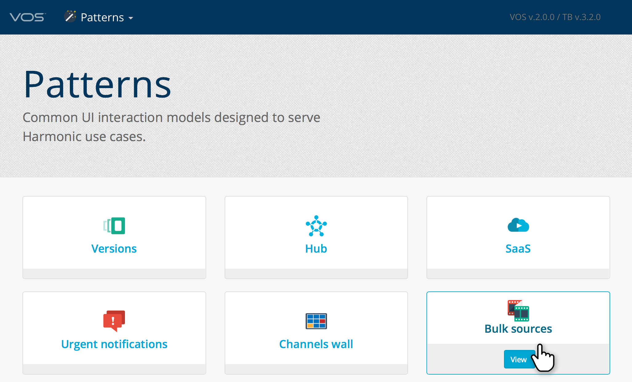
Fig 13: UXHub—Patterns
Fig 14: Video—Use case walkthrough
Because our team was globally distributed, my deliverables on UXHub offered design guidance including narrated, video walthroughs of UX patterns applied to product use cases. Product Managers and Engineers could "lean back" and review my presentations asychronously in their respective time zones.
Develop
A powerful, simple and delightful user experience framed with a beautiful user interface is academic until developed to work in the real world, to perform at scale and be extensible. To that end, some of my first and most important users to please are the developers. My deliverables to them should not only be clear and organized, but also excite them to work toward the design goal, because everyone wants to give their best to a product that looks great.
On VOS my UI production team delivered significant front-end code as described in the Design stage which freed back-end programmers to focus on the heavy-lifting of micro-service engineering, API development and integration. During this stage, I was available on demand to answer questions, clarify direction, provide detailed pseudo-logic and offer guidance on corner cases.
Fig 15: Prototype code tested and ready for Production integration
Deploy
Production deployment can be fulfilling and nerve-racking. But despite conventional wisdom—that a designer's role is now complete—the design has only completed its first cycle. In fact, this is the time to discover again, learn how the product performs in the real world and repeat the process. This cycle is as important as the seminal design itself. Informed, continuous deployment is a hallmark of a successful product.
With VOS I evaluated the live product from two categorical sources: usage data and customer feedback.
For usage data we embedded two, 3rd-party tools. The first captured impressions, clicks and workflow funnels. The second was user-elective and captured screen shots of individual users at work in the UI.
Customer feedback came from several sources, including Sales Reps, trade shows, arranged meetings and a Community Forum.
The goal was never to solicit feature requests, but rather observe, listen and interpret customer goals into features, and ultimately incorporate them into a product roadmap. That way we, the architects, would design the product for our customers and not the other way around—a win-win where business goals and customer needs aligned.
Success
I dramatically influenced company culture to shift from legacy tech toward
design thinking, including company re-organization and new hires.
VOS recognized with multiple
design innovation awards from industry publications and trade shows—
NAB and
IBC.
VOS won multi-million dollar customer contracts within weeks of beta launch—including cord-cutters' live TV service
DIRECTV NOW.
Conclusion
I used every bit of my experience, skills and creative thinking to bring the VOS platform to life. It was a daunting task at the outset, but the work paid off in the form of industry recognition and, most importantly, engaged, paying customers. The evolution continues...
My roles on this project
Design Leadership and Evangelism
UI Engineering Team Management
Strategy and Product Roadmap


