Traveal by Sabre
A simple mobile app
to discover hotel deals and inspire impulse travel.
I was blown away by Jason's ability to instinctually translate
business requirements into functional wireframes and elegant designs.
Will Pinnel
DIRECTOR OF MOBILE STRATEGY,
SABRE HOLDINGS
Background
Sabre Travel Network, best-known as the parent company of Travelocity.com, hired me to help their
Mobile Strategy Group design a leisure travel mobile app.
The goal was to repurpose the company's travel inventory and
transaction API, to highlight transitory hotel deals, promote the hotel venues and make in-app reservations a breeze.
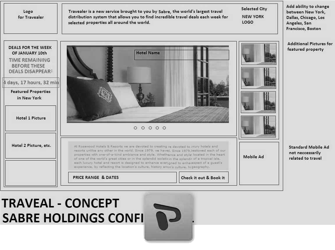
Sabre's Director of Mobile Strategy, provided impeccable direction
to catalyze creativity — simple, clear slides illustrating the product concept and top-level user
experience.

Fig 0.1: Sabre provided PowerPoint slides illustrating the concept
Brainstorming
The double-edged sword of good design is that it can make good ideas look great and make bad ideas look better than they really are,
so early design attempts usually should not be
polished. Crude sketches are a good way to lower inhibitions and develop ideas with the entire team.
Epiphanies can come from anyone, so when team collaboration is important, I've learned to restrain visual chops
until later and encourage everyone to sketch their thoughts and scribble on top of others. At this stage nothing is precious.
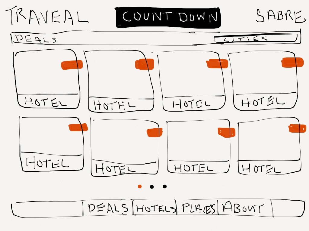
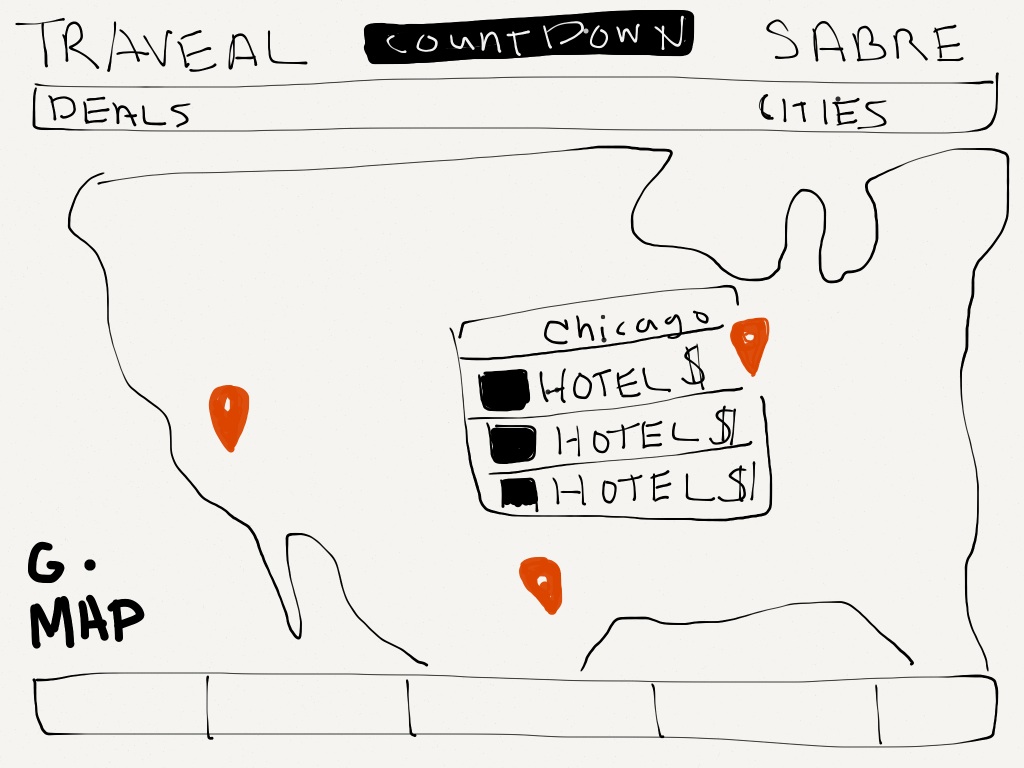
Fig 1: Sketches: Crude, fast
For Traveal I began by sketching the concept of a limited time offer by placing an animated, signature countdown timer anchored in the header of
every browse screen — a friendly, looming reminder that the deals were transitory.
Sabre has a lot of hotel partners comprising tons inventory, and the temptation was to offer all of it at once.
When asked, users inevitably say they want more of everything, so why not give it to them?
Because too many options are paralyzing, and overwhelming
choice leads to fatigue and inaction. Instead, I proposed that we limit display to 8 current deals
from different cities —
enough for variety but not too much to absorb in a glance. A map view would provide for
browsing by location.
Specifications
After several iterations of sketches, presentations, note-taking and corrections, we reduced the features and screens to the bare
minimum to support the experience. We had the outline of a minimum viable product encompassing a comfortable 6 screens. Final
specs included the sketches with annotations, plus written documentation describing the user and system interactions.
User Interface Design
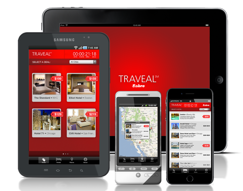
With the specs and screenflow defined I could shift focus to the aesthetics of the UI. I kept it organized
and familiar with an IOS-style grid, rounded corners and subtle depth, layering price-tag icons atop
hotel photos. I proposed red for the background hue for a few reasons:
First, red reflects urgency — in this case the urgency to act before a deal is gone. Second, blended red hues
feel luxurious evoking the elegance of the hotel accommodations. Third, red is Sabre's corporate color (duh!).
While the color could become overbearing in an app where users spend a lot of time,
we wanted Traveal users to purchase quickly and exit. And when they didn't, the intensity of the interface
was memorable — leaving a poignant mind-print and an impulsion to return.
Fig 2: The primary screens customized for iPad
Implementation
From the outset I always design for the medium and usually get involved in front-end implementation. I carefully balance design, coding considerations and deployment. With Traveal I was a proponent of building
a multi-platform Web app.
A single codebase of Javascript, HTML and CSS
could be repurposed for
any mobile platform, served to a Web browser and/or compiled to fast-performing native apps for
iOS, Android™, Windows® Phone.
The Ionic
SDK allows for access to all device functions required in this app, including geolocation.
Credits
Product Designer
Jason Schmidt
Project Manager
Derek Peachey
Software Developer
Eric Mansfield
